In fashion photography, the absence or misuse of color can lead to flat, uninspiring images that fail to evoke the desired emotions or highlight the essence of the clothing. However, by effectively incorporating color, you can transform images into vibrant visual stories that truly resonate with your audience.
This blog will delve deep into the spectrum of color theory, its applications in fashion photography and techniques to enhance your shoots. From exploring the color wheel and color harmonies to understanding the psychological impact of different colors, we will cover it all. So, step into the vibrant world of color and discover how you can elevate your style with color fashion photography.
What is Color Theory in Color Fashion Photography?
Color theory is a cornerstone of the visual arts, outlining how colors interact, complement, contrast, and influence one another. Stemming from Sir Isaac Newton’s color wheel developed in 1666, it’s been refined and expanded to include essential components such as primary, secondary, and tertiary colors, along with their tints, shades, and tones.
In the context of fashion photography, color theory is used to curate a visual narrative, where colors in an image can give rise to certain emotions, set the mood, and guide the viewer’s gaze.
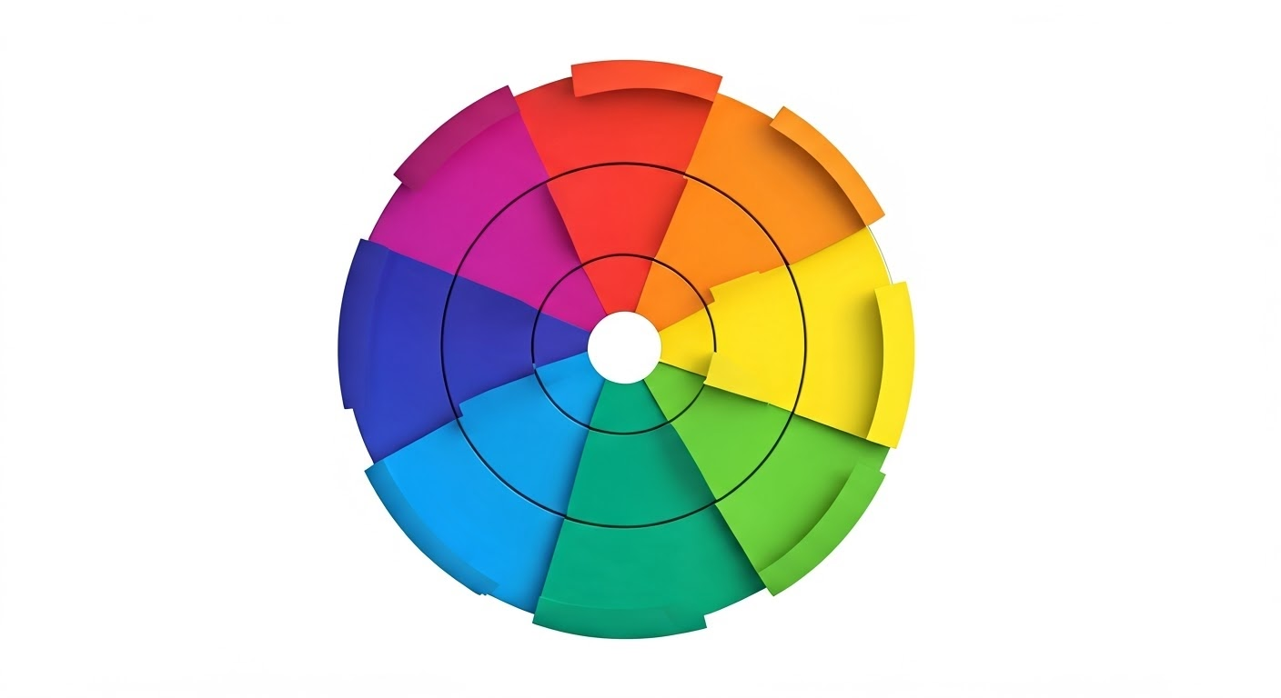
Understanding the Color Wheel
At the heart of color theory lies the color wheel, a fundamental tool representing the relationships between colors. Broken down into three categories – primary colors (red, blue, and yellow), secondary colors (green, orange, and violet) formed by blending primary colors, and tertiary colors (red-orange, yellow-orange, yellow-green, blue-green, blue-violet, and red-violet), created by mixing primary and secondary colors.
Understanding and leveraging the color wheel in fashion photography can significantly enhance your choices for clothing, props, and backgrounds. For instance, pairing a blue outfit (primary color) with an orange backdrop or prop (complementary secondary color from red and yellow) can introduce a complementary color scheme, creating a striking contrast that captivates the viewer.
Hence, studying and implementing these color relationship principles of the color wheel can elevate your fashion photography, enabling you to create engaging, vibrant, and artistically harmonious photographs.
Color Properties and Harmonies
Mastering color properties and harmonies is crucial to creating aesthetically pleasing images. These components of color theory provide a framework for creating balanced, visually appealing designs and photographs.
- Hue: Treated as the basic color type, hue refers to the distinct color family within the color wheel. Each primary, secondary, and tertiary color is identified by a specific hue.
- Tint: When white is added to a hue, lighter versions of that hue are produced, known as tints. For example, adding white to red produces pink, a tint of red.
- Shade: Created by adding black to a hue, it forms darker versions referred to as shades. Maroon, for example, is a shade of red.
- Tone: When gray is introduced to a hue, it creates more subdued or toned-down versions known as tones.
Understanding the above aspects of color contributes to building color harmonies or schemes that are pleasing to the eye. Here are the main ones applicable to fashion photography:
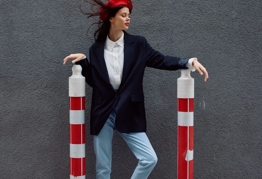
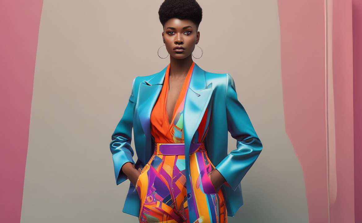
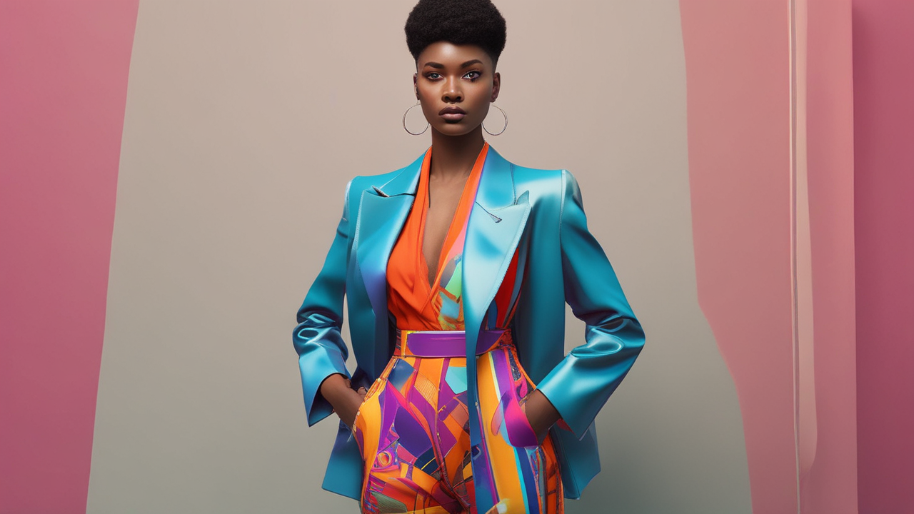
- Complementary Colors: This scheme combines colors that sit opposite each other on the color wheel, like red and green or blue and orange. These high-contrast pairs create vivid, “pop” images.
- Analogous Colors: This scheme uses colors next to each other on the color wheel, such as red, orange, and yellow, or blue, turquoise, and green. The harmonious blend gives calming and relaxed vibes.
- Triadic Colors: This scheme includes three colors evenly spaced on the color wheel, offering a balanced yet vibrant feel.
- Monochromatic Colors: This scheme plays with shades, tints, and tones of a single color, providing a minimalist, unified, and elegant look.
Strategically using these color schemes in fashion photography can create visually striking images that resonate with your viewer’s emotions.
How can Color Theory Enhance Fashion and Clothing Product Photography?
Expert use of color theory can elevate fashion and product photography into a visual feast. The thoughtful color selection highlights features, evokes emotions, tells a story, and enhances the appeal. Let’s explore how the right application of color theory can transform fashion and clothing photography.
Highlighting Key Features
By employing appropriate color schemes and understanding color properties, a photographer can direct the viewer’s attention to the desired spot in the image, reinforcing the product’s unique selling points.
- Contrasting Colors: Complementary or split-complementary schemes create contrast, drawing attention to the subject.
- Saturation: Boosting saturation highlights product features, making photos pop and capturing attention.
- Color Balance: Mixing warm and cool tones adds depth and emphasizes key areas, like cool blues for backgrounds and warm reds for subjects.
- Selective Color: Retaining color in a monochrome image effectively directs focus to key highlights.
Seasonal and Trend Adaptation
Adapting to seasonal color preferences is a strategic decision that taps into the viewer’s subconscious associations and current mood. For instance, a spring photoshoot might lean towards fresh, vibrant colors like pastels or floral tones. On the contrary, an autumn shoot could tap into the rich, cozy tones.
Staying current with trends like Pantone’s Color of the Year keeps your work relevant, aligning with colors influencing global fashion and design. Trend-based hues resonate with audiences familiar with these visuals, enhancing their connection to your photos.
Product Differentiation
Utilizing the principles of color theory in fashion photography can be a powerful medium for product differentiation. Depending on how color is used, it can emphasize a unique feature, convey a distinct brand personality, or create a particular mood specific to the product.
For instance, if a clothing brand’s unique selling point is its earth-friendly materials, employing a green color palette across your photoshoot can associate the product with sustainability and set it apart. Similarly, a luxury brand might opt for jewel tones to convey opulence and exclusivity.
Understanding and tapping into these color cues can, therefore, serve to clarify a product’s unique position within the market, setting it apart in the minds of potential customers.
Also read: Elevate Your Shoot: 15 Shoe Photography with Model Ideas
The Role of Light in Color Fashion Photography
Different lighting conditions can significantly influence how colors appear, creating varying effects and emotional responses. Understanding this interplay between light and color can help photographers make deliberate choices about the time, place, and type of light to use for their fashion shoots, thereby achieving their sought-after visual moods and effects.
How Light Affects Color Perception?
The perception of color heavily depends on the quality of light interacting with an object. The same color can look dramatically different under diverse lighting conditions, displaying variations of hue, intensity, and even saturation. For example:
- Natural Light: Daylight’s color changes throughout the day; morning light adds a cool, tranquil feel, while dusk creates a warm, glowing sentiment.
- Overcast Light: Cloudy days diffuse sunlight, softening shadows and creating evenly lit photos with natural, less saturated colors.
- Artificial Light: Tungsten lights cast a warm yellow-orange glow, while fluorescent lights create a cool, bluish tint, affecting color rendering.
- Mixed Light: Combining natural and artificial light requires careful white balance adjustments to maintain color accuracy.
Lighting Techniques to Enhance Colors
Fine-tuning your lighting technique is another path to mastering color fashion photography. Here are a few lighting tips to enhance your fashion shots:
- Golden Hour: The warm, radiant light shortly after sunrise or before sunset adds an enchanting glow, enhancing both models and clothing.
- Blue Hour: Twilight’s cool blue tones create a tranquil mood; balance with warm clothing tones for striking contrast.
- Diffused Light: Softens harsh light, reducing shadows and enhancing vibrant, natural colors. Use diffusers, shade, or overcast conditions for this effect.
- Backlighting: Creates rim light, separating the model from the background, adding depth, and making outfit colors pop.
- Color Gels: Infuse dramatic, mood-enhancing effects by adding gels to light sources.
- Light Painting: Use a moving light source during long exposures to creatively “paint” color and light, adding a unique touch to fashion photography.
How to Master Color Combinations and Coordination in Your Shoots?
Thoughtful coordination of apparel colors with backdrops, props, and lights based on the principles of color theory can drastically influence the outcome of your photo shoots.
From choosing complementary color combinations for striking contrast or an analogous color scheme for a cool, harmonious feel to developing a color palette consistent with brand identity and messaging – mastering color combinations and coordination can provide creative control over visual impact, storytelling potential, and viewer engagement in your fashion photography.
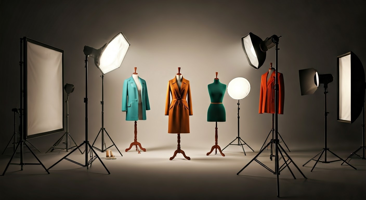
Developing a Color Palette for Your Fashion Shoot
Developing a coherent color palette for a fashion shoot involves considering the clothing, setting, props, and lighting. It’s about creating a harmonious mix of colors that compliments the mood, theme, and goals of the shoot while maintaining brand consistency. Here’s a simple guide to formulating a color palette for your fashion shoot:
- Define primary colors: Start by identifying one or two dominant colors. This could be the color of the main outfit or the brand color, aligning with the theme of the shoot.
- Choose secondary colors: Add one or two supporting colors that complement your primary colors and add harmony to the photos.
- Accent colors: Include a contrasting or complementary color that pops and draws attention. Use it sparingly to highlight important features.
- Consider neutrals: Incorporate neutral colors like white, black, gray, or beige that serve as a balanced backdrop, making your primary and accent colors stand out.
Using Color Schemes and Harmonies to Guide the Eye
Color can effectively guide the viewer’s eye and create a visual pathway in an image. Ensuring that color schemes are used methodically can amplify this effect, drawing attention toward or away from certain elements within the photograph.
- Contrast: Using contrasting colors or light and dark values can guide the eye to the subject of interest, creating focus and displaying key features.
- Balance: Distributing colors across the frame creates balance. Being visually heavier, dark colors can be balanced out with a broader area of lighter colors.
- Movement: You can guide the viewer’s eye through the frame by placing related or similar-colored objects along a path.
- Isolation: A spot of unique color against a neutral background draws the eyes instantly to the spot, effectively isolating the subject.
- Repetition: Repeating a color throughout several parts of an image can create a sense of unity and pull the viewer’s eye across the image.
How to Use Color Theory in Post-Processing for Color Fashion Photography?
Transforming your images with post-processing software opens a world of opportunities to apply color theory principles further. From subtle adjustments to dramatic transformations, tools like Adobe Lightroom or Photoshop make it easy to tweak color balance, adjust saturation, enhance certain hues, create a mood or even undertake expansive color grading.
Controlling color in post-processing helps photographers create images that reflect their desired mood and narrative. Additionally, experimenting with colors can provide fresh, unique perspectives, enhancing the appeal of fashion photographs.
Color Grading and Color Correction in Fashion Photography
Color grading and color correction in fashion photography are pivotal in enhancing visual appeal and conveying the desired mood. Understanding color theory is vital for fashion photographers to create impactful images.
Photographers can elevate their fashion shoots by utilizing the color wheel and exploring complementary, analogous, or monochromatic color schemes. Adjusting white balance and saturation levels can significantly impact the overall look of the photographs.
Enhancing and Experimenting with Colors in Post-Processing
Playing with colors during post-processing can rectify imbalances and add an unparalleled sense of creativity and flair to your photos. Here are some ways you can experiment with colors when editing fashion photos:
- Converting to black & white focuses on textures, forms, and composition while giving a timeless feel.
- Cross processing adjusts RGB curves to create unexpected color shifts, adding intrigue to fashion images.
- Split toning applies different colors to highlights and shadows for dual-tone effects.
- Using filters alters color balance, adding warmth or coolness to evoke specific moods.
- Selective colorization preserves color in selected areas, enhancing key features and adding drama.
Read our blog on Pose Like a Pro: 25 Fashion Photography Poses to Try
What is Color Psychology, and How Does it Impact Fashion Imagery?
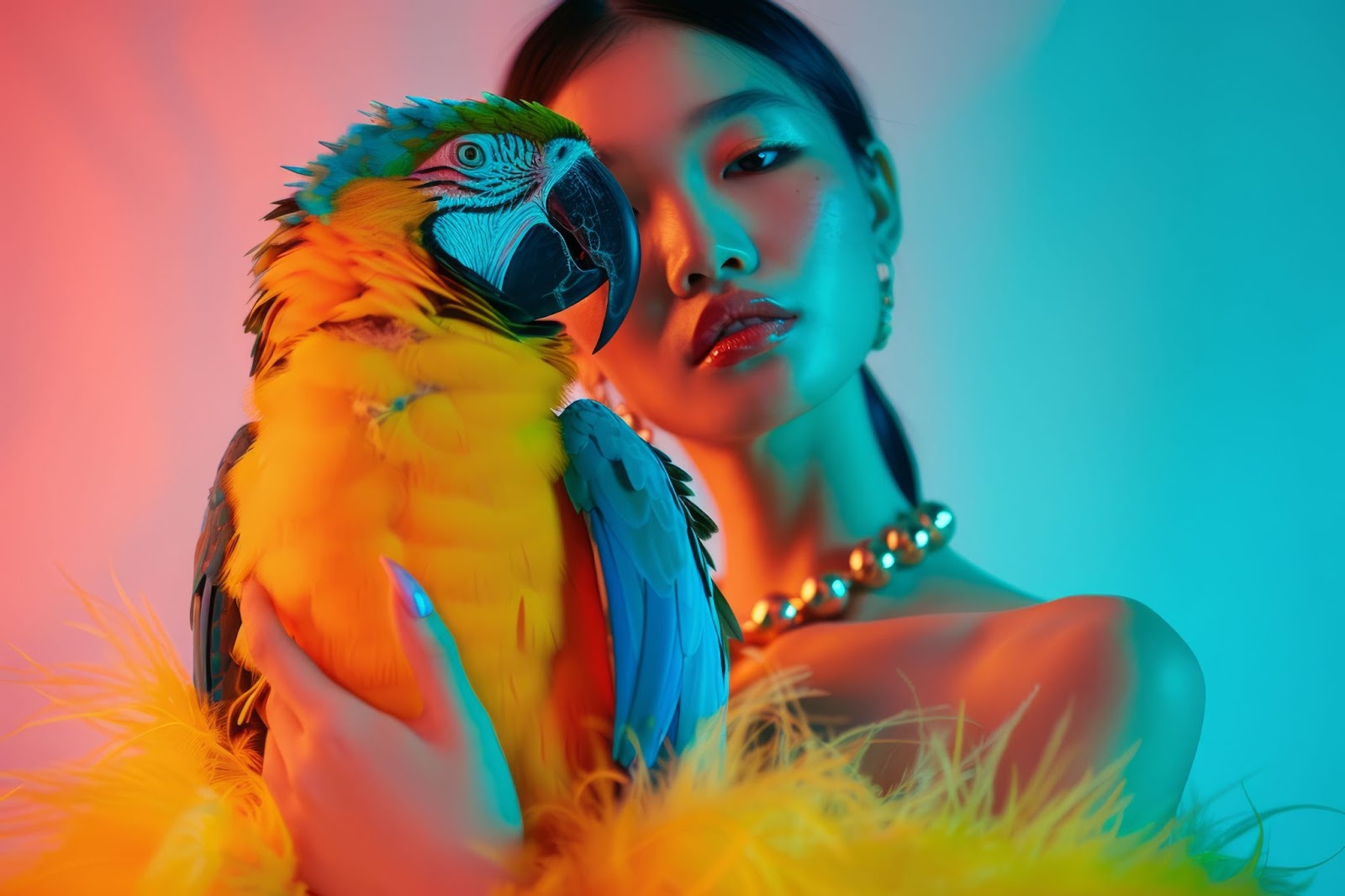
Color psychology is the study of how colors influence our emotions and behavior. Different colors can evoke different feelings, reactions, and perceptions, often subconsciously.
In fashion photography, understanding the emotional and psychological effects of colors can play a crucial role in planning your shoots. By choosing the right combination of colors, you can evoke specific moods and emotions, influencing the viewer’s response to your image.
So, let’s break down the emotional and psychological connections of some common colors.
Emotional and Psychological Effects of Colors
Recognizing how different shades can conjure various feelings can be beneficial in eliciting the desired reaction from your audience.
- Red: Often associated with passion, power, and excitement. A red garment can breathe life into a photograph, bringing an energetic and bold vibe.
- Blue: Known to evoke feelings of calm, tranquility, and stability. It often translates photographs into serene, trustworthy, and reliable imagery.
- Green: Resonates with freshness, harmony, and growth, making it perfect for eco-friendly brands or outdoor shoots.
- Yellow: Instills a sense of cheerfulness, optimism, and creativity. Indeed, it is a great pick for summer and spring collections.
- Purple: Combining the calmness of blue and the vivaciousness of red, purple induces a sense of luxury and mystery.
- Black: Symbolizes elegance, power, depth, and sophistication. It can give weight to high-fashion shoots or add contrast to make colors pop.
- White: The color of purity, peace, and simplicity. It offers a universally appealing backdrop, making other colors stand out.
By incorporating these emotional and psychological connections into your fashion photography, you can guide your viewers on a visual journey that not just shows but also tells a story.
Read our blog on Jewelry Photography with Model: Expert Tips and Tricks
Leveraging Color Psychology to Evoke Moods and Emotions
While the connection between color and emotion is intuitive, grounding it in color psychology can enhance the emotional impact of your images. The right color choice can provoke specific emotions and leave a lasting impression.
For a vibrant sports apparel shoot, using bold reds and oranges can evoke energy perfectly.
Additionally, pairing saturated colors with neutrals or varying lightness within a color family can create versatility and evoke different emotions. Leveraging color psychology can transform fashion photos into compelling narratives with increased visual appeal.
Transform Your Brand’s Visual Identity with Flix Studio’s World-Class Photoshoots
At Flix Studio, we understand the pivotal role that color plays in shaping a brand’s narrative. Our team of experienced professionals is well-versed in color theory and its applications in fashion photography. Leveraging this knowledge, we tailor each photo shoot to your unique brand narrative, selecting colors that align with your brand ethos, emphasize key product features, and resonate with your target audience.
From conceptualization to post-processing, we are committed to delivering impeccably crafted images that elevate your brand’s visual persona and compel your audience to engage with you.
Partner with Flix Studio and let our world-class fashion photoshoots transform and amplify your brand’s visual identity.
Conclusion
In the world of fashion photography, color is a powerful storyteller. A deep understanding of color in fashion photography allows photographers to utilize colors to their advantage effectively, creating fashion images that aren’t only visually pleasing but communicate a powerful narrative that harmonizes with a brand’s individuality.
Be it in creating the perfect contrast that pops, setting soothing harmonious tones, or invoking a specific feeling via the psychology of colors – the mastery of color theory allows photographers to maximize their creative potential and stand out in the fast-paced, ever-evolving fashion industry.
Frequently Asked Questions
What camera settings and equipment are best for capturing vivid colors?
Investing in a camera with a good dynamic range and color depth is advisable for capturing vivid colors. Using certain camera settings like RAW mode, adjusting the white balance to the lighting, and experimenting with low ISO values can also help retain color detail in your shots.
How do I become a successful color fashion photographer?
Becoming a successful color fashion photographer involves mastering color theory, lighting, and composition. Keep practicing and experimenting with different styles and techniques. Develop a distinctive style, understand your client’s needs, and keep up-to-date with current fashion trends and technologies.
What are complementary colors, and how do they impact fashion photography?
Complementary colors are pairs of colors that are opposite each other on the color wheel. In fashion photography, their use creates striking contrasts and visual excitement, making the subject stand out. They can add dynamic tension to an image, creating a vibrant and energetic feel.
How do different colors affect the perception of fashion products?
Colors can dramatically affect how fashion products are perceived. For instance, bright and bold colors might suggest an energetic, young, and fun product, while soft, muted colors might imply sophistication and elegance. Colors can set a mood, highlight a feature, and influence purchase decisions.